
Case study, 2026 · Wix Studio
RAISA Technologies
A defence-grade web presence for a security intelligence company serving governments across Africa.
Client
RAISA Technologies
Sector
Technology and security intelligence
Location
Abuja, Nigeria · work across Africa
Live site
raisatech.com ↗
The brief
The audience reads like an auditor. Procurement officers and infrastructure operators compare every vendor against global technology and defence companies with enormous budgets, and a generic website quietly fails that comparison. RAISA already had a strong brand identity; the job was translating it into seven working pages that keep the standard from the first click to the footer.
The credibility problem was also a day-one problem. RAISA could not warm up slowly over years of good delivery. Every element on the site had to say the same thing at once: established, precise, serious.
What we did
Dark, on purpose
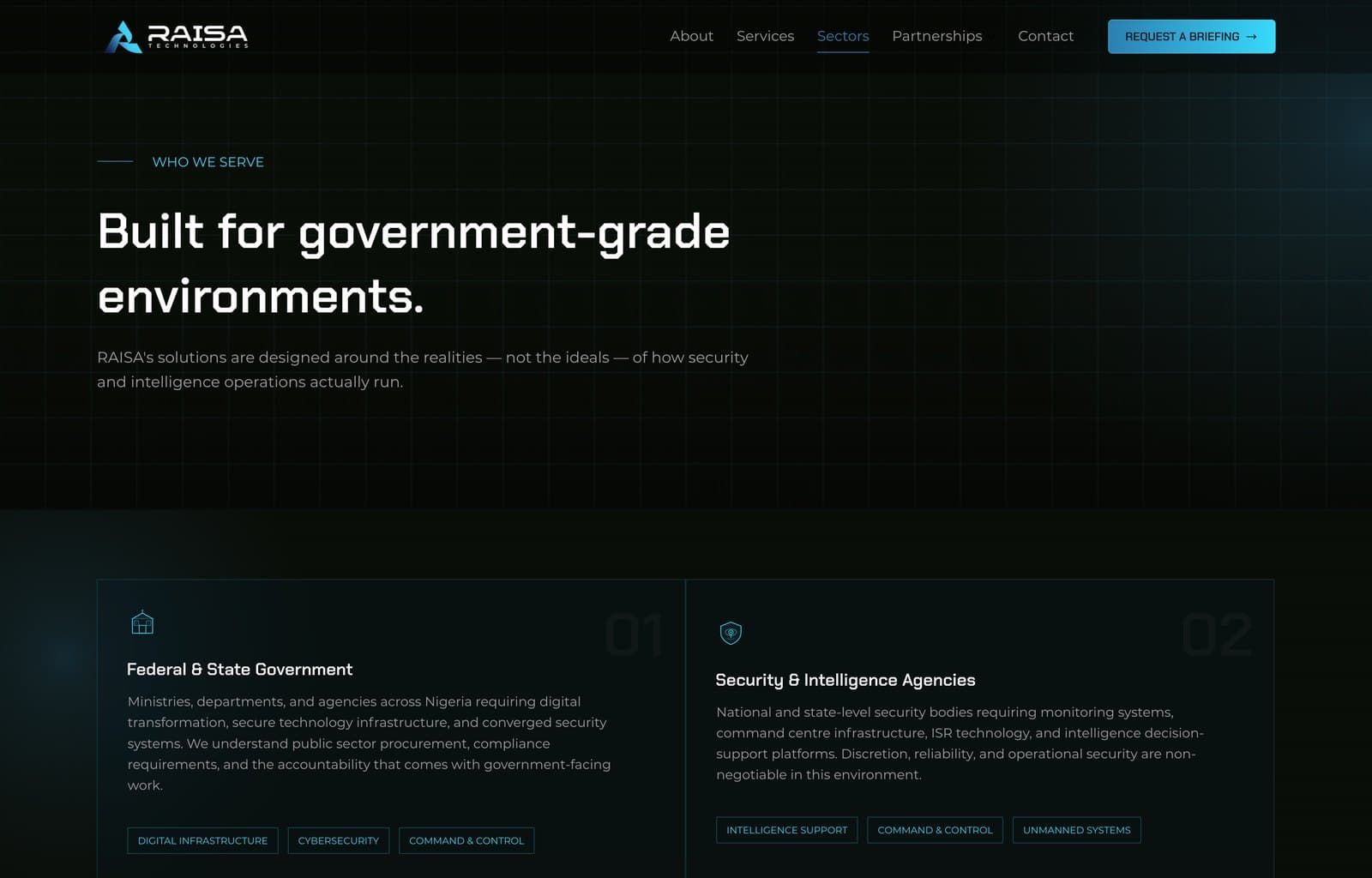
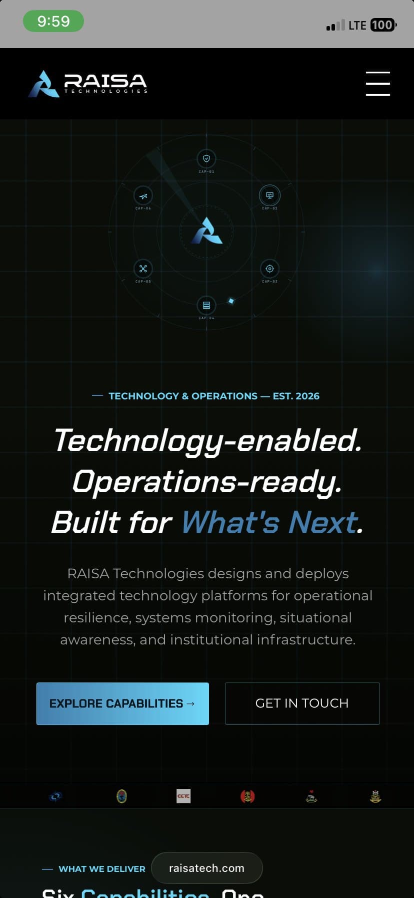
The site is dark-first so the brand's accent colours run at full strength against near-black. It is the same logic the global technology and defence brands use: on white, these accents read as a friendly startup; in the dark, they read as a signal.
A command display instead of a stock photo
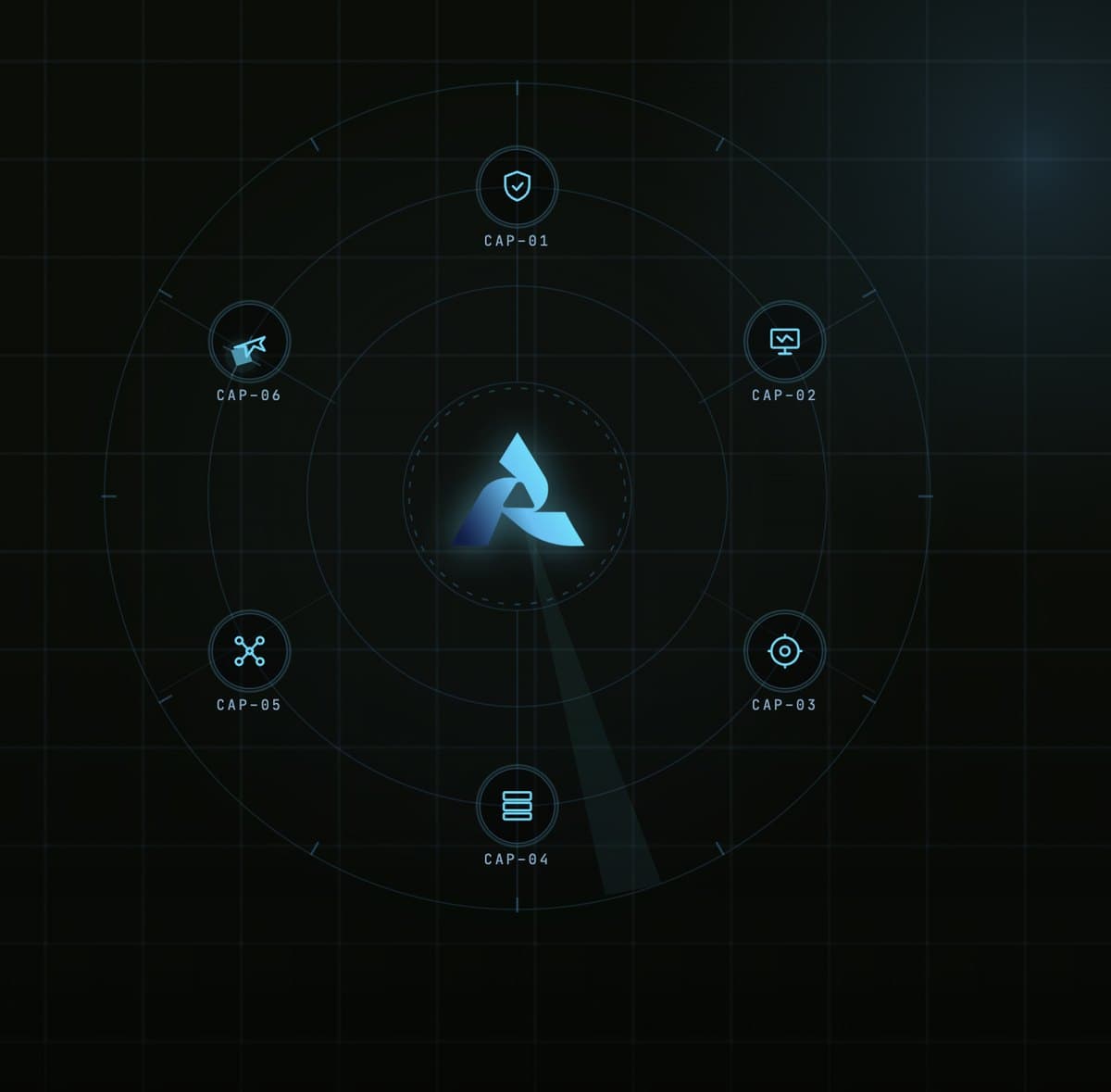
The hero graphic is a custom animated SVG: capability nodes orbiting the RAISA mark on radar rings. It is built as a standalone embed, isolated from the page's own code, so the animation stays smooth on modest hardware and can be dropped anywhere the brand needs it.
One grid under seven pages
A tactical dot-grid system sits beneath every page, giving the whole site a single visible logic. It adds depth without the stock photography of server rooms and fibre optics that technology sites reach for by default.
An icon library drawn for this brand
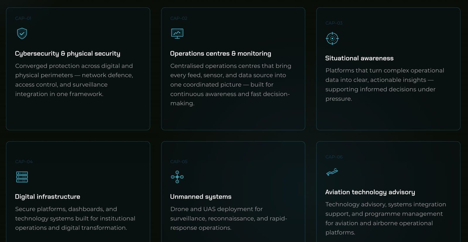
Every icon on the site was drawn for this project, matched to the geometry and weight of the wordmark. The set carries the six capability cards, the sectors pages and every utility corner of the seven-page site. One borrowed icon is enough to break the seriousness of a page, so none were borrowed.
Language for the people who actually read it
The primary action is “Request a briefing”, not “Get in touch”. The site speaks the way its audience already speaks.
The result
The result is structural. The seven pages share one system: the icon library, the dot grid and the animated command display extend to whatever RAISA ships next, so new capability pages inherit the tone without a redesign. And in the rooms where infrastructure decisions are made, RAISA now enters with a web presence that matches the weight of its work.