
Case study, 2025 · Wix Studio
Le Bleu Home Decor
An ecommerce store for a home decor brand, designed so every product feels like art, not inventory.
Client
Le Bleu Home Decor
Sector
Home decor and interiors
Location
Barbados
Live site
lebleuhomedecor.com ↗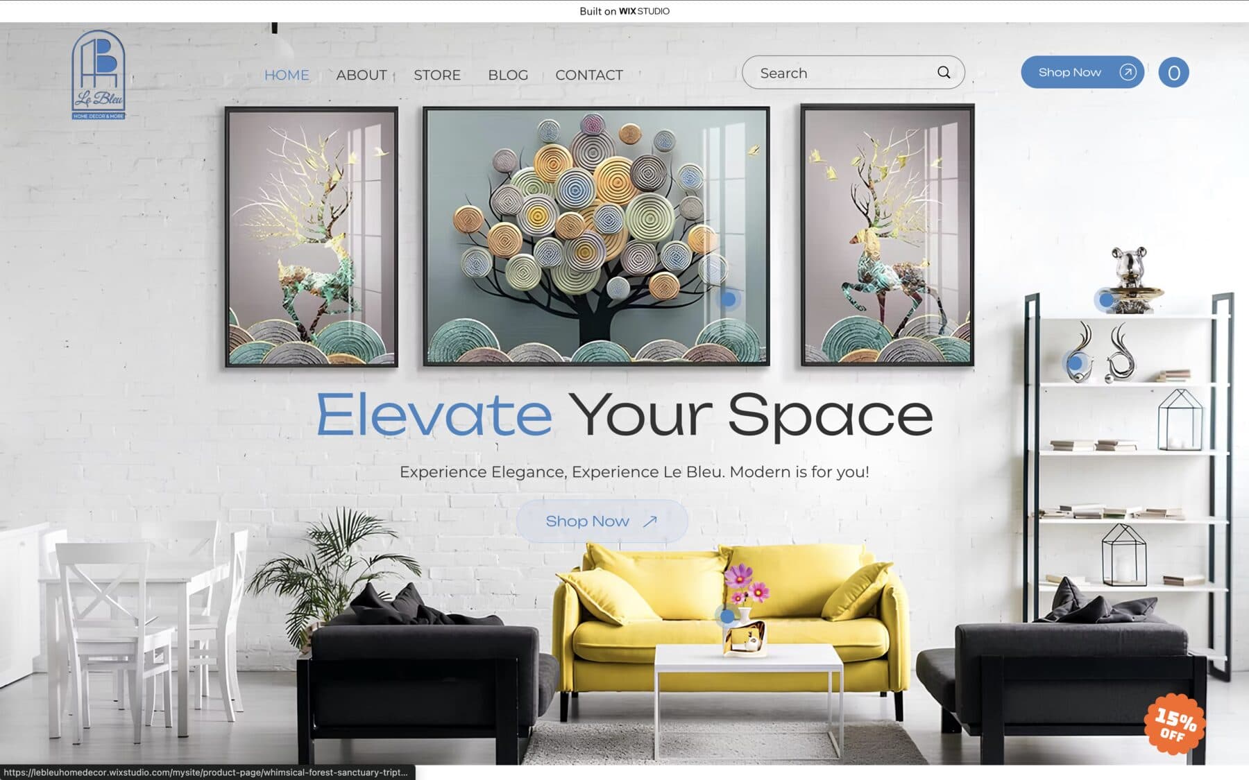
The brief
Decor is bought with the eyes first. A standard product grid would have made sculptural pieces feel like warehouse stock, and pieces in this price range do not sell on specs. They sell the moment a shopper pictures them in her own room. The store had to create that moment on every screen, then turn it into a purchase before the feeling faded.
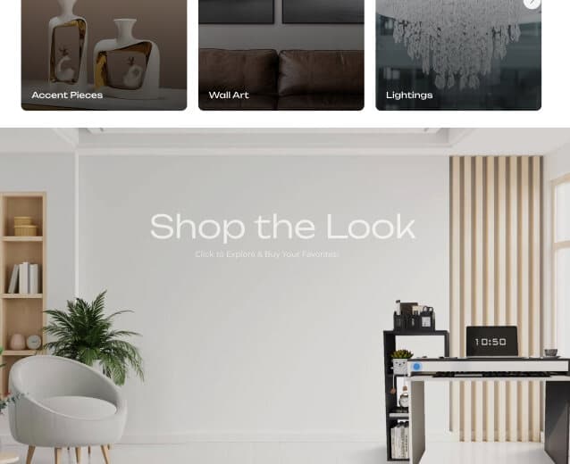
The practical brief was a complete store on Wix Studio in a matter of days: hero, collections, product pages, shop grid, brand story, and the path to checkout. Plus one thing the platform does not offer out of the box: a shop-the-look feature, custom built, that lets shoppers buy straight from styled room photos.
What we did
A hero that sells the room
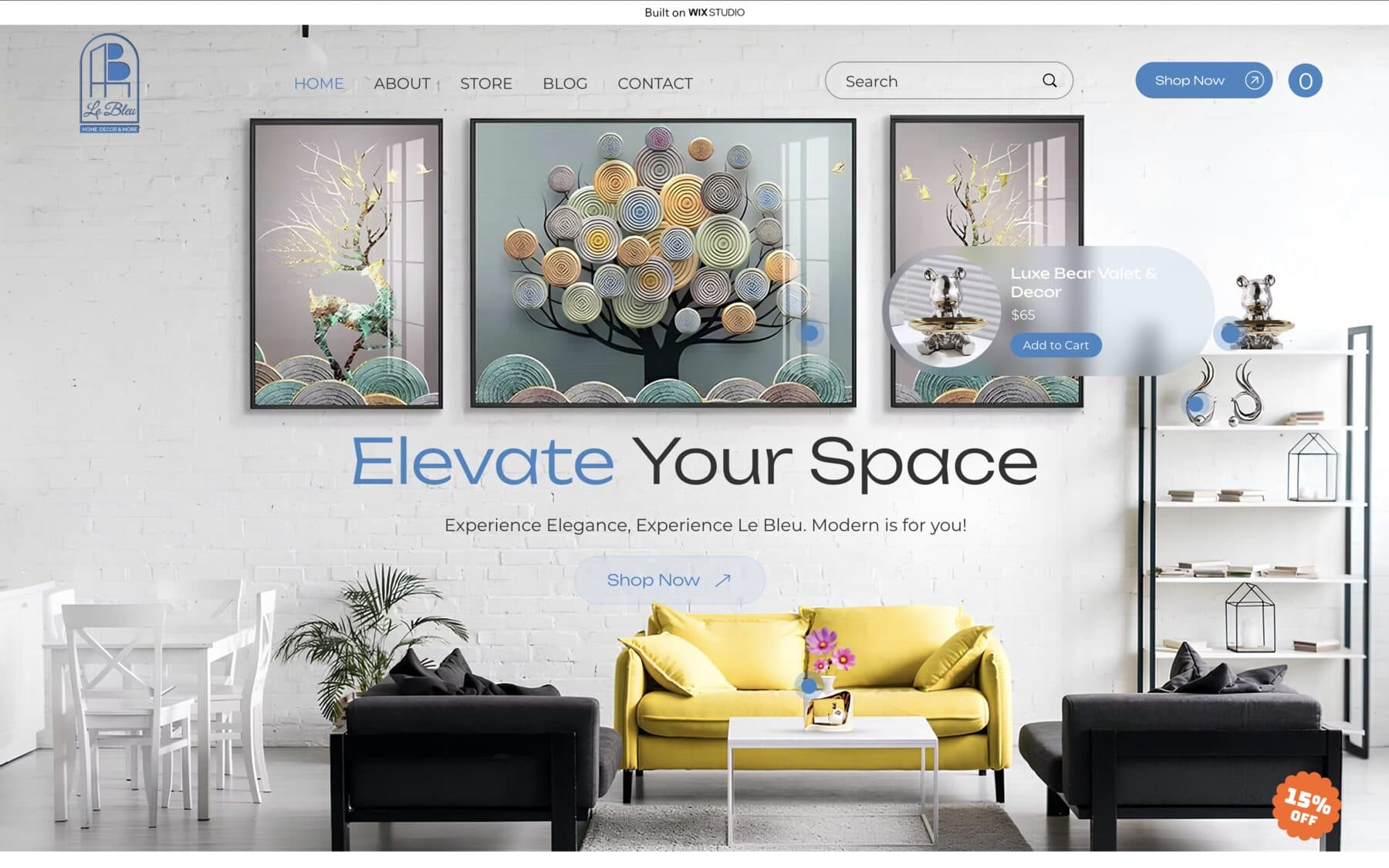
The first screen is a styled living room, not a menu: three statement artworks over the headline, one Shop Now button, and product hotspots already working in the hero itself. Shoppers understand the brand's taste before they read a word.
Shop the look, built from scratch
Styled photos carry tappable hotspots, and each one opens a quick-view card with photo, name, price, and Add to Cart. The Luxe Bear Valet at $65 can go from spotted to carted without leaving the page. No plugin does this on Wix the way Le Bleu needed it, so it was custom created for this store.
Collections curated like rooms
Accent Pieces, Wall Art, and Lightings open as three image-led doors instead of a filter sidebar. Each collection gets its own mood at a glance, so browsing feels like walking through rooms rather than querying a database.
A stage per product
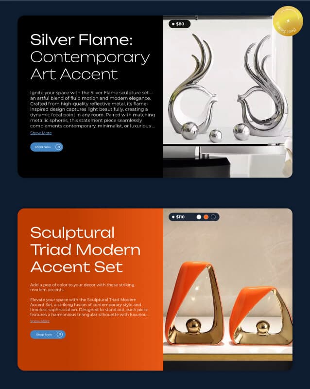
Hero products get full spotlight sections, each with its own color world: Silver Flame on black at $80 with a Best Seller badge, the Sculptural Triad on burnt orange at $110 with color variants, Golden Orbit at $90. Price pill, description, and shop button stay consistent, so the drama never costs clarity.
A grid that lets pieces breathe
The main shop grid keeps cards consistent and whitespace generous: one photo, one name, one price. Nothing shouts, so every piece gets an equal chance to be wanted.
The result
The finished store reads as a gallery that happens to check out. Shoppers move from a styled room to a hotspot to the cart in seconds, and the brand story and finale call to action close the visit for those still deciding. The footer carries the credit line “Designed by Boluwatife,” which is exactly where a store this confident should put it.